
 by Matteo Modica
4 MIN. READ
03.04.2019
by Matteo Modica
4 MIN. READ
by Matteo Modica
4 MIN. READ
03.04.2019
by Matteo Modica
4 MIN. READ

Like a building or a custom-made suit, even a logo ages. It can happen more or less quickly, but just as in the case of a building or a suit at some point, you can’t look the other way. Even if you have put it off for a long time, it is time to pass the brief to a designer for a new logo. And here the doubt often arises: change it completely or opt for a logo restyling?
Given that both interventions will have important effects, here are the situations in which I would recommend one of the two options.
When is a simple restyling of the logo worthwhile?
By logo restyling, we mean an optimization of the logo that modifies its shapes, typography, and colors in a more or less light way, while maintaining its general recognizability. In some cases, it is the best choice.
1. It is a consumer brand with high visibility and notoriety
If the logo has been on signs, posters and maybe on store shelves for a long time, losing recognition can be serious damage. A logo restyling is therefore a must.
2. The logo contains a mascot/character familiar to the public
Characters of this type often have a strong emotional value and losing them risks “emptying” the brand. It is better to update them and give them new life with a logo restyling.
3. The logo contains references to the company’s heritage
A certain typography or graphic sign can be part of the history of the brand and therefore have a value not only of recognizability but of “guarantee”. In these cases, the designer’s task is to enhance and update these elements with a logo restyling.
4. The logo has been made recently and people like it, but it has some technical limitations
It may happen that a logo that also convinces everyone shows, as it is used in different contexts (e.g. very small or very large prints, video or web, co-presence with other logos) design defects. In this case, with a logo restyling the designer can surgically intervene on critical aspects.
An entirely new logo loses almost all contact with the previous one, often intentionally. Not only that, but it also expresses very different values and concepts. In some cases, rather than a logo restyling, a new logo is the obligatory choice.
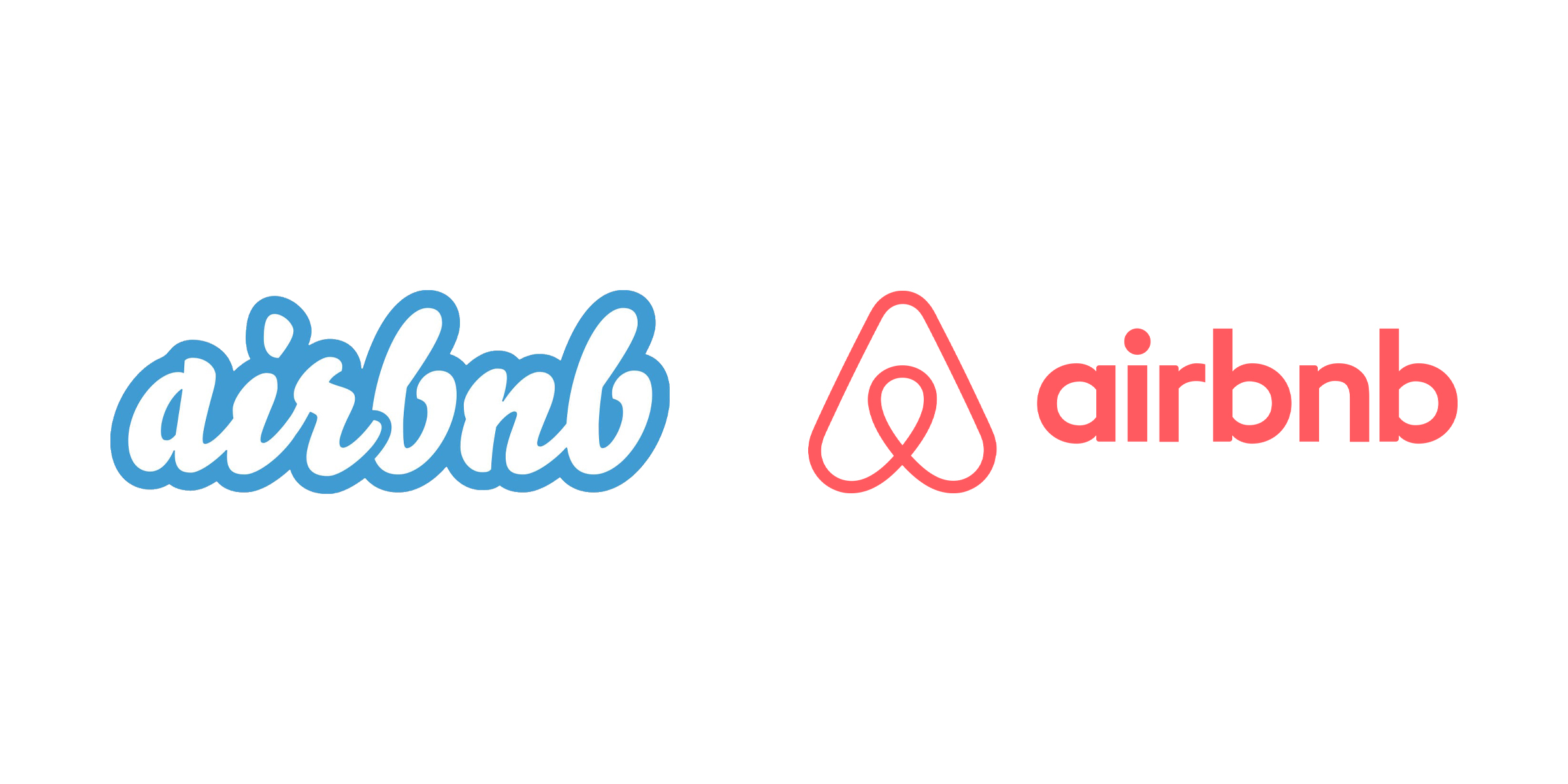
1. You want to communicate a strong renewal of the company
A new property, a new industrial direction, maybe a new mission: such important changes can motivate the adoption of a logo that symbolizes this step. Changing the logo can be especially significant when the company emerges, renewed, from a crisis of results or trust.
2. The old logo contains anachronistic references
In some cases, the logo may use symbols and concepts that are no longer relevant or have become incomprehensible to the public. In this case, a change of logo is urgent and necessary.
3. The old logo is no longer aligned with the values of the company
Historical logos, born in contexts with different value sets, can be offensive today. In a more or less unconscious way, those who designed them at the time included elements that we now consider racist, sexist, or generally unacceptable. In this case, to limit oneself to rejuvenating it would be an own goal: as if to say that we want to bring this vision into our era.
4. The logo is identical to another, pre-existing one
It may come as a nasty surprise to discover that the logo that had developed is identical to that of another brand. Beyond the dishonesty or lightness of those who designed it, such a discovery does not leave much chance.
5. The logo, if you look closely, is ugly
Come on, it happens. Maybe it was done in a hurry, created by a committee, or approved by someone who’s gone in the meantime. Unless it has a great value of recognition, in these cases it is better to be honest and simply change it.
But big brands don’t always do that!
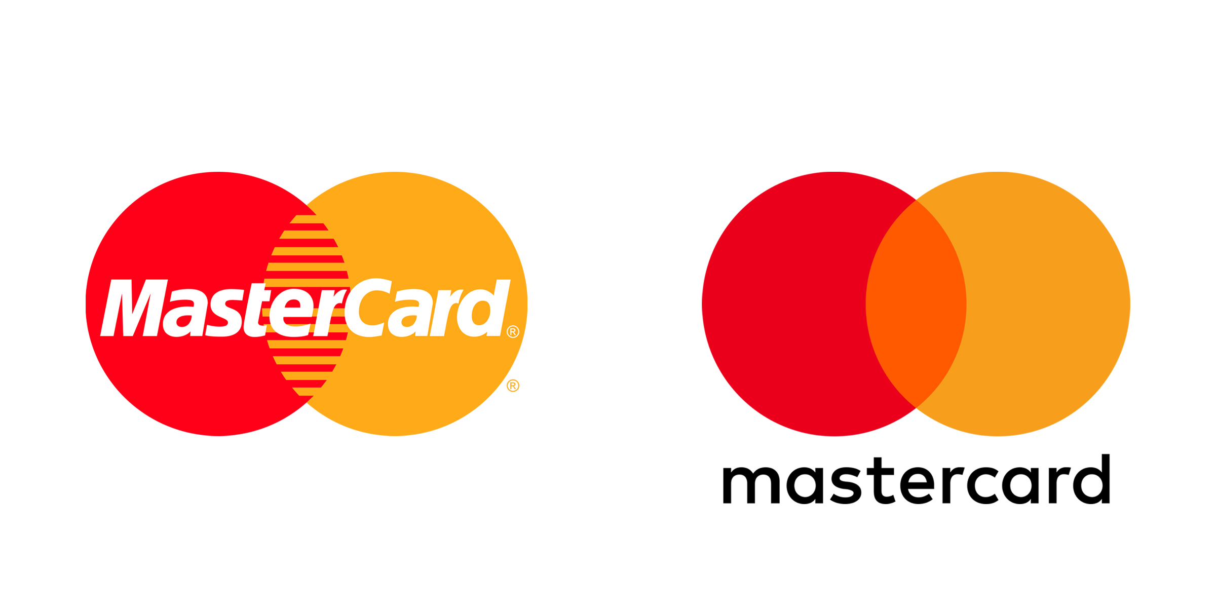
Given that these rules are not absolute, it must be said that big brands don’t always make the right choice.
Think of the famous case of Tropicana, which spent $35 million to launch a new packaging (with a logo restyling). The result? A 20% drop in sales and a hasty return to the old logo.
Or the numerous luxury fashion brands such as Burberry, whose logo restyling seems to have made their logos lose the original and unique character that distinguished them.
READ MORE ON

Before you hire a branding agency, ask to see the drafts
A while ago, at Sublimio we started sharing with potential clients not just our portfolio, but our past presentation. Here’s why.

Can AI do your brand strategy?
AI can craft a pretty believable brand strategy, but will it hold? Here are some things to know before you forward it to the team.
Rejected Logo Designs We Still Love
Not all logo designs get accepted. Actually, most of them get rejected, and that’s ok. Here’s why we don’t throw ours away.

Do you have a brand architecture? Here’s why you should
If you find the term “brand architecture” intimidating, you might want to do this. Because the right one makes all the difference for your business.
our newsletter
SUMO is one of the few newsletters I don’t archive when my inbox gets full. Each edition feels crafted with care - the links are genuinely interesting, the curation is thoughtful, and the newsletter design itself is a delight to consume.

Content curation at its finest. Doesn't overdo it on commentary, and has probably the highest signal-to-noise ratio among the design newsletters out there. Never a dull entry! Every issue feels handpicked rather than churned out.

Sublimio Monthly is always a breath of fresh air. I especially like how each issue explores one timely theme, turning Andrea and Matteo’s perspectives into a clear takeaway I can immediately apply to my work—often before the topic becomes mainstream.

You know that feeling as a kid, waiting for your favorite magazine to hit the stands? That's what SUMO is for me.

SUMO is much more than a newsletter: it's a guide. In a world of information overload, having someone who does real curation work is invaluable. What I find there is always worth my time. I read it eagerly every time, and I often share it with friends and colleagues because there's always something useful and genuinely interesting.

SUMO has a level of intentionality that sets it apart from most newsletters I read. Each edition is built around a theme that feels considered without being overworked, with Matteo and Andrea’s dual perspectives adding depth and a set of curated links that feel carefully chosen. It’s a newsletter worth reading properly.

SUMO has quickly become one of my favourite newsletters. Every issue leaves me with a fresh perspective on how I see my brand and the world around it.




© 2009—2026 Sublimio


